← Back to Projects
Full-StackIterating

Portfolio Website

Living engineering portfolio that turns projects into structured technical case studies instead of a static screenshot gallery.

I built this site so recruiters and engineers can evaluate my work the way I want it evaluated: systems thinking, design decisions, iterations, evidence, and reflection. Hardware, software, research, embedded, ML, CAD, and product work all land in one visual and narrative system. Typed project data drives cards, routes, heroes, and media. Case studies attach by slug. Featured work and supporting builds get different homepage weight so experiments stay archived without competing with flagship projects. Adding a project should feel like publishing into a system, not redesigning a page.

Engineering highlights

  • Typed project model powering home, list, and detail routes
  • Structured case-study shell: motivation through reflection
  • Featured vs supporting homepage hierarchy
Date
2025-2026
Focus
Meta
Build stage
Continuous iteration
Disciplines
Frontend Engineering · Product Design · Technical Communication · Information Architecture
metafrontenddesign-systemdocumentation
Site walkthrough

Eight-second pass through the homepage and project structure.

Full write-up below. The hero is the short version. This is the build story: what I designed, what broke, and why I made the calls I did.

Motivation

Why I started this

What pulled me in, and what I wanted to get better at.

Why I built it

My earlier portfolio showed what I built without consistently showing why it mattered, how the system worked, what failed, or which tradeoffs shaped the final version.

What interested me

I wanted something closer to an engineering notebook than a polished résumé gallery. Substance first, then depth for anyone who wants to inspect the reasoning.

What I wanted to learn

Technical communication is a design problem. The hard work was deciding what a reader needs in the first minute versus what rewards a longer read.

System Overview

How the system fits together

A Next.js portfolio that turns projects into structured technical case studies. Typed project data drives cards, routes, heroes, and media. Flagship work and supporting builds sit in separate homepage bands so not every experiment competes for equal weight.

01

Project data model

Typed TypeScript objects for summary, stack/disciplines, media, links, and status. New projects are mostly data, not new page scaffolding.

02

Case-study layout

Shared narrative shell: motivation, system overview, disciplines, decisions, evolution, results, reflection.

03

Homepage hierarchy

Staged hero, featured band, supporting builds, then personal engineering direction.

04

Media system

Images, videos, diagrams, demos, and custom visuals with captions and hero selection.

05

Intake tooling

Scripts for project intake, sync, analysis, and media import so publishing becomes a workflow.

Data flow

Project object (+ optional case study by slug) → home cards / list → project route → exec summary hero + narrative layout + media.

Control flow

Featured vs supporting is explicit in data. Missing case studies fall back to a lighter layout until migrated. Media trust checks keep broken local paths out of production heroes.

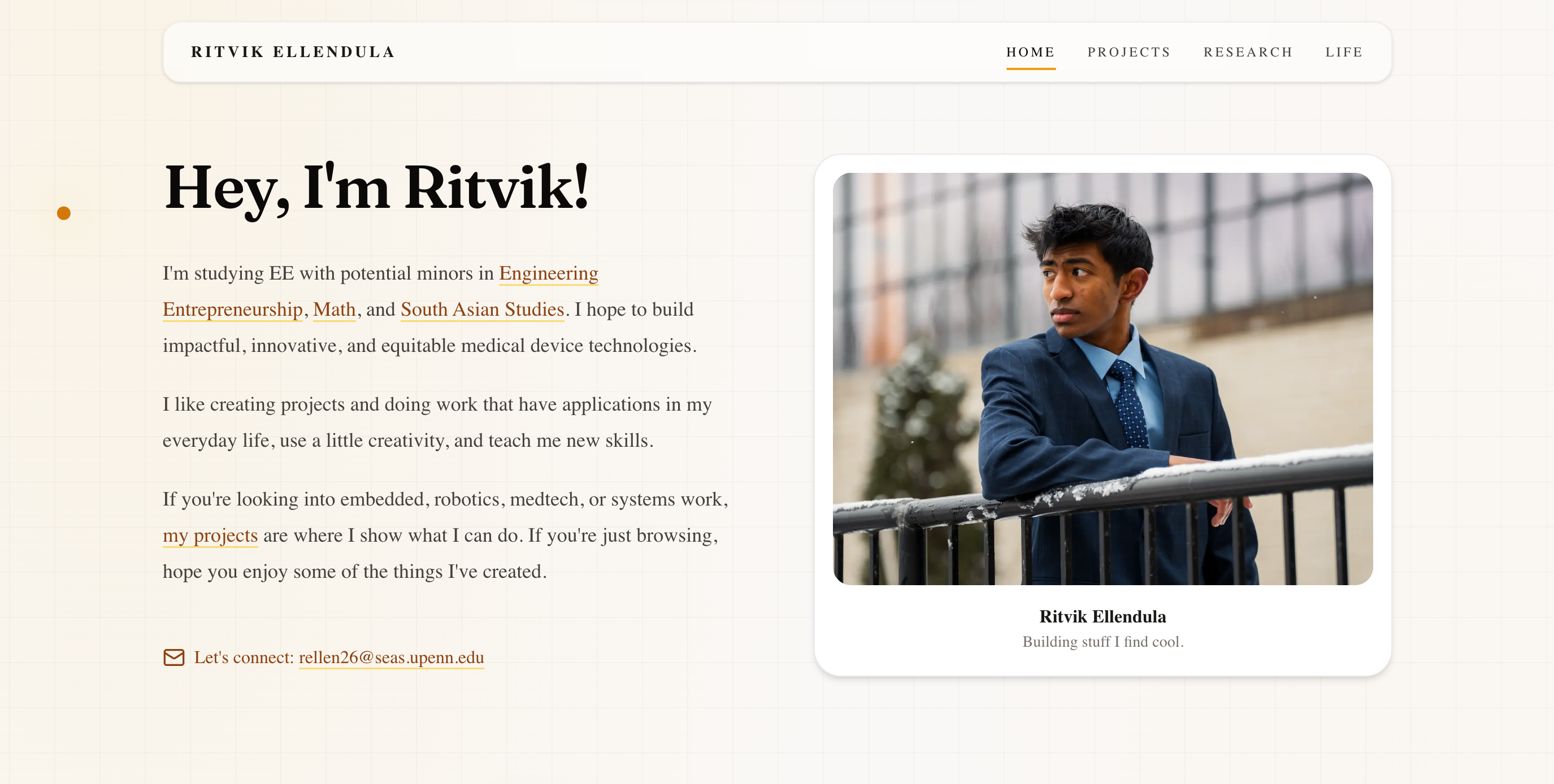
Homepage
Portfolio homepage

Hero, featured work, and supporting builds as one composition.

Engineering Breakdown

Broken down by discipline

Each block covers the goal, the design, what broke, what changed, and what shipped.

01Frontend Engineering

Frontend Engineering

Goal

Ship a fast App Router site where structure scales without redesigning every page.

Design

Next.js 16, React 19, TypeScript, Tailwind CSS 4. Centralized project objects power home cards, list pages, and detail routes. Components handle mixed media without per-project UI forks.

Challenges

  • Consistency across hardware, compilers, ML, and product work without flattening everything into one template voice.
  • Keeping motion purposeful instead of decorative noise.

Iterations

  • Conventional project gallery
  • Reusable cards + detail layouts
  • Structured case-study shell with staged hero motion

Final implementation

Typed project model, shared EngineeringCaseStudyLayout, Framer Motion / CSS for restrained interaction, Lucide for iconography, Vercel deploy.

Case study page
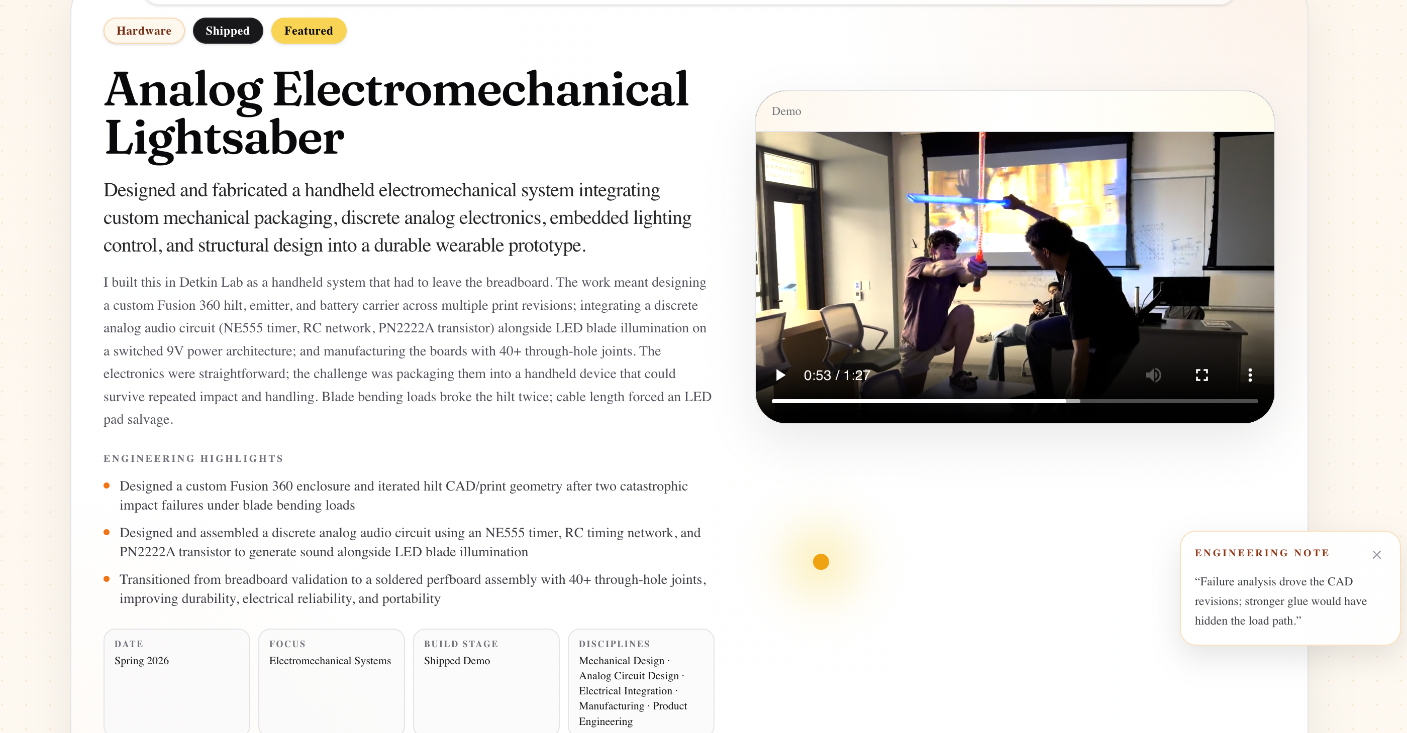
Sample project case study page

Exec summary up top, deeper engineering narrative below.
02Information Architecture

Information Architecture

Goal

Make every project readable in under a minute, then deep enough for an engineer to inspect.

Design

Executive summary first (one-liner, disciplines, stack, status, highlights, links, primary media). Then motivation, system overview, discipline breakdowns, design decisions, evolution, results, reflection.

Challenges

  • Generic tech-stack lists hid the real work.
  • Equal visual weight made flagship and experiment projects compete unfairly.

Iterations

  • Screenshot gallery
  • Featured vs supporting split
  • Discipline framing + case-study sections

Final implementation

Homepage hierarchy plus a reusable case-study skeleton. Only relevant disciplines appear per project.

03Product / Visual Design

Product / Visual Design

Goal

Feel engineered and personal, not like a generic dark neon developer template.

Design

Warm stone and amber tones, large editorial type, rounded cards, generous spacing, restrained motion. Hero stages text, photo, then workbench instead of animating everything at once.

Challenges

  • Corporate startup landing energy vs personality.
  • Long-form technical writing needs calm surfaces, not glow effects.

Iterations

  • Earlier gallery aesthetic
  • Warm editorial palette lock-in
  • Motion sequencing cleanup on the hero

Final implementation

Warm cream / stone / amber / black system that supports dense technical pages without drowning them.

Site walkthrough

Short compressed cut of the homepage and project structure.

Key Design Decisions

Calls I actually made

What else was on the table, what I picked, and why it still made sense once the hardware was real.

01

Typed project data instead of hand-built pages

The problem

How do you add projects without rebuilding UI each time?

Alternatives considered

  • Separate hand-coded page per project
  • Central typed project model + shared layouts

Tradeoffs

Hand-built pages are freer and diverge. Structured data is more consistent and scales.

Why I chose this

Centralize project information in TypeScript. Case studies attach by slug when the narrative is ready.

02

Separate featured work from supporting builds

The problem

Should every project compete for equal visual weight?

Alternatives considered

  • Flat equal grid
  • Featured band + supporting section

Tradeoffs

Flat grids archive everything evenly and bury the strongest work. Split hierarchy guides attention without deleting smaller experiments.

Why I chose this

Darker warm featured band for flagship projects; lighter supporting section for tools and learning builds.

03

Warm editorial styling over neon developer aesthetic

The problem

What should the site feel like?

Alternatives considered

  • Dark neon tech portfolio
  • Warm stone / amber editorial system

Tradeoffs

Neon reads as generic. Warm editorial is more personal and better for long technical writing.

Why I chose this

Stone, cream, amber, and black with restrained motion.

04

Show failures and iterations as evidence

The problem

Do polished finals hide the real engineering?

Alternatives considered

  • Final screenshot only
  • Evolution, debugging, and limitations on-page

Tradeoffs

Perfect finals look clean and shallow. Process media takes space but proves reasoning.

Why I chose this

Evolution and results sections treat iteration, measurements, and limits as first-class content.

Evolution

How it got here

Bench bring-up, CAD fits, soldering, and the demos in between. Not just the final photo.

  1. v1

    Conventional gallery

    Projects existed, but depth and process were uneven.

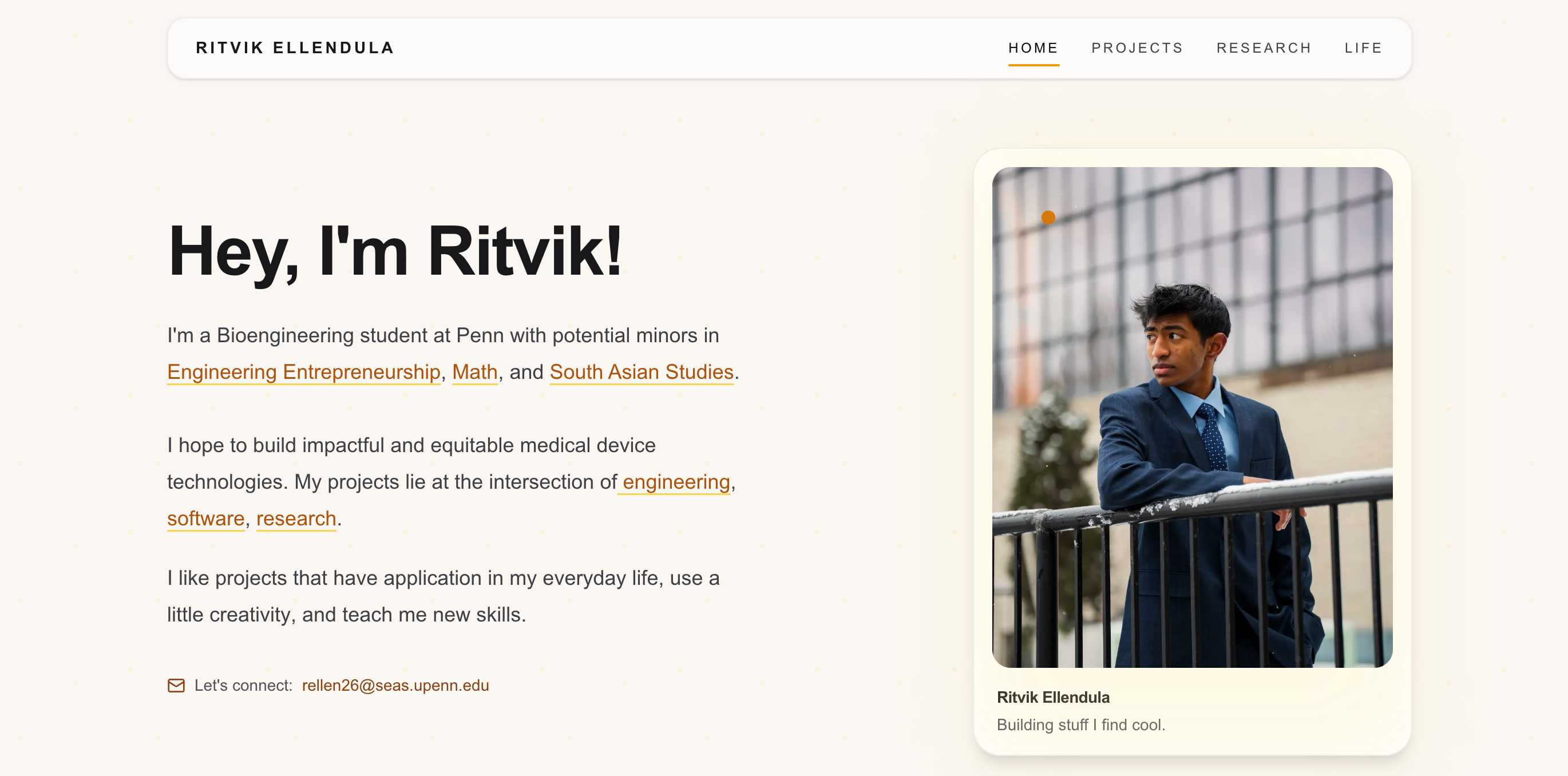
    Earlier surface
    Earlier portfolio cover
  2. v2

    Homepage hierarchy

    Preserved the hero concept, staged its motion, and split featured work from supporting builds.

    Homepage hierarchy
    Current homepage
  3. v3

    Case-study system

    Replaced generic stack framing with disciplines where it mattered, and expanded project pages into structured case studies with reusable media handling.

    Case study shell
    Case study product page
  4. Now

    Publishing workflow

    Intake tooling for new entries, media import, and analysis so adding a project becomes a repeatable process instead of a one-off coding task.

    No media for this milestone yet.

Results & Validation

What held up

What worked in the end, what I can show for it, and where it's still limited.

Living technical archive

Live site

The site works as a recruiter-facing portfolio and as a record of how projects evolved across hardware, software, research, and product work.

Reusable publishing system

GitHub

Typed project data, shared case-study layout, and intake tooling make new work easier to document without redesigning the interface.

Clearer attention hierarchy

Featured vs supporting framing keeps flagship multidisciplinary work visible without deleting smaller experiments.

Photos and clips

The runs and stills that match the results above.

Walkthrough

Homepage through project structure in about eight seconds.

Limitations

  • Evidence quality still varies by project; some pages need stronger diagrams, measurements, and build photos.

Reflection

Looking back

What surprised me, what I'd redo, and questions I'm still chewing on.

What surprised me

  • A strong project can look shallow when the page only shows the final product.
  • A smaller project becomes meaningful when the learning objective, failure modes, and next steps are clear.

What I would redesign

  • Keep pushing architecture diagrams, measurements, and iteration timelines into every flagship page.
  • Keep demo media short and web-compressed as new clips land.

Future improvements

  • Stronger validation media on older projects
  • Tighter intake → published case study loop
  • More process evidence instead of only polished finals

Questions that emerged

  • What does a recruiter need in sixty seconds versus what should reward a deep read?
  • When does structure help technical communication, and when does it flatten the story?